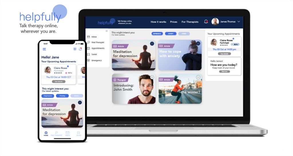
helpfully
About Project
The ‚helpfully‘ app case study aims to connect people with mental health issues with therapists online. It is targeted towards people who seek talk therapy online because they are either highly mobile, out of sheer convenience, to save time, their immobility or various other reasons.
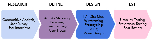
The discovery phase for helpfully began in Mai 2021 with competitive research and user interviews. We discovered that people had been looking for a way to do talk therapy online but did not know if such an app or possibility existed. The resulting prototype is an initial hypothesis on how I hope to solve the problem.
My Role
Ideation, conceptualization, UX research, end-to-end design of the prototype and preparation for hand-off to development was solely my responsibility. This also encompassed competitor research, usability testing and
Tools used: Adobe Illustrator & Photoshop, Figma, Usabilityhub, Marvelapp, Miro, Slack.
Duration: Mai – October 2021, 5.2 months
Role: UX Researcher, UX&UI Designer
The Problem Space
Therapy in general is time consuming endeavor with multifaceted inconveniences. Available therapist first have to found and contacted if they actually have slots available. Then Sessions have to be scheduled and the clients lives often have to be moved around those appointments. Getting to and from the therapist practice can take anywhere between 20-50 minutes.
But what if the therapy seeker lives remotely, far away from a potential therapist’s practice, has no means to get around, facing a lack of public transportation or is physically disabled? This transcends the before-mentioned time consuming element of inconvenience.
Especially COVID-19 pandemic revealed that there is a sincere need for remote talk therapy.
The challenge was to create a product that is intuitive for a wide array of users no matter what their individual IT prowess or impairments was and to motivate them to give talk therapy a try.
User Research
During the research phase I was keen to understand:
+ User attitudes towards in-person and online therapy
+ Reasons users would consider using an app for/to support their therapy
+ What underlying needs users have that helpfully should manage to fulfill
+ User opinions on competitor app(s) – identifying pros and pain points
Key Insights
• Mutual understanding is that talk therapy is very important in today’s world and people should speak more openly about to it to remove the stigma around it and more people should actually do it.
• Since Covid more people are using video calls in private, professionally and for talk therapy
• Interviewees would pay between 120-200€ per month out of pocket for treatment (short term or severe illness)
• Online therapy could be very beneficial for a wide array of people
• No therapy apps were known or used
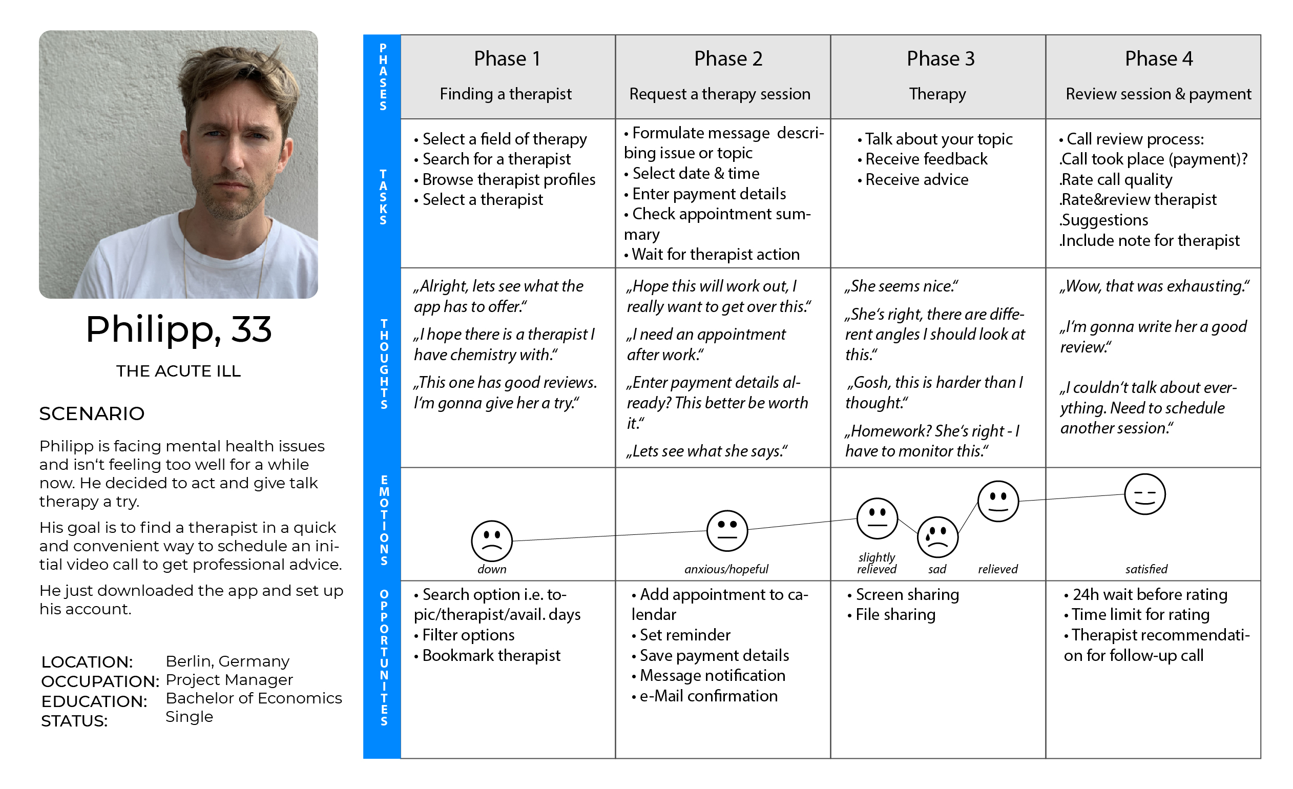
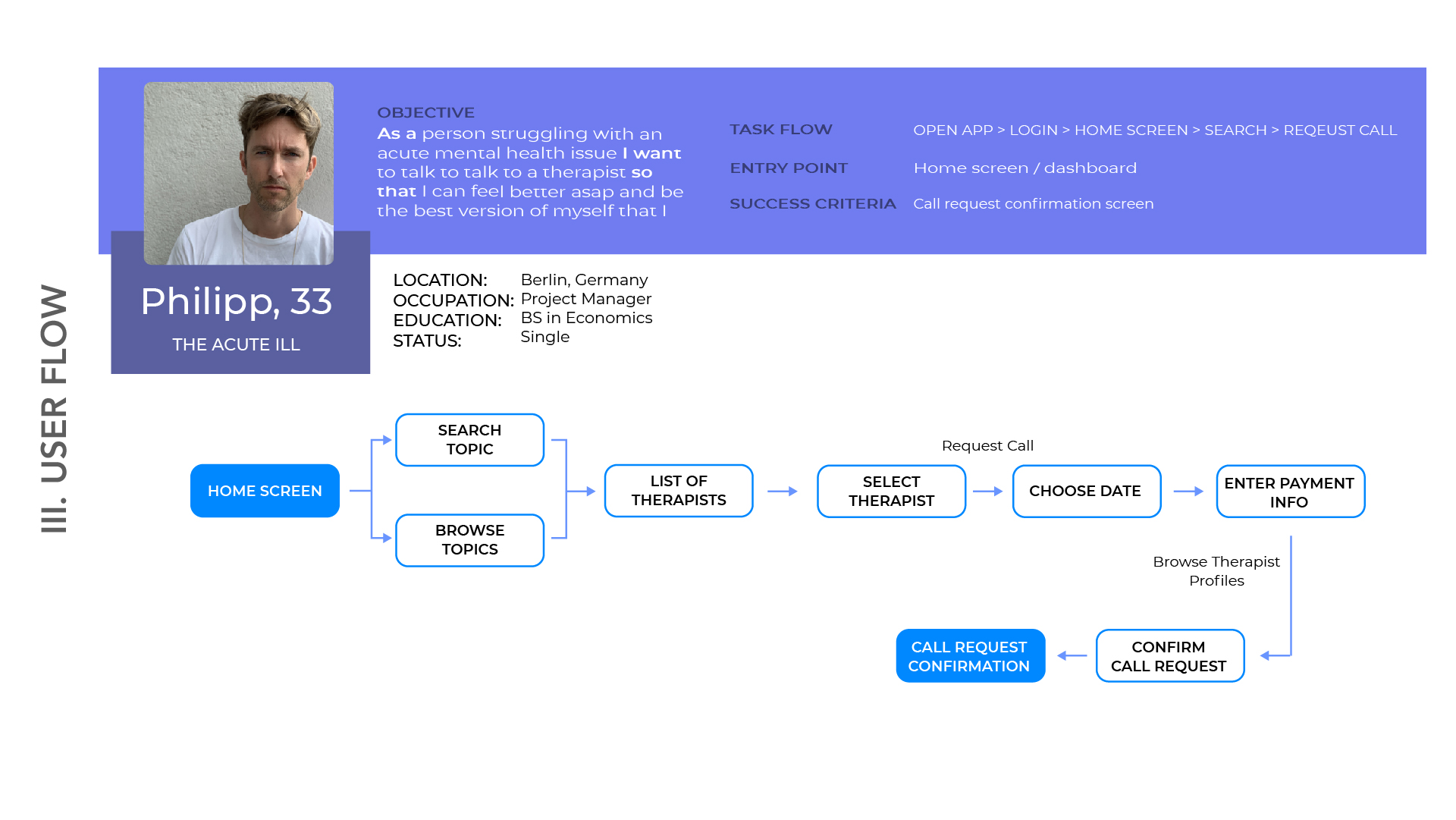
User Journey
Based on the research, two user personas were created in the early stages of the project. A third is in progress based on the new insights I’ve gained after time spent on the project.
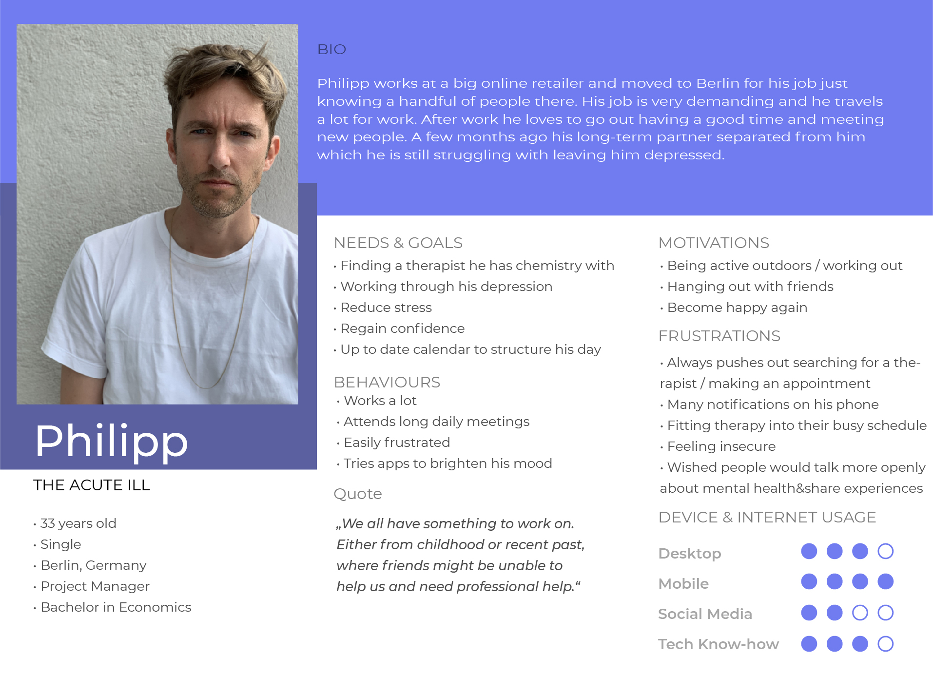
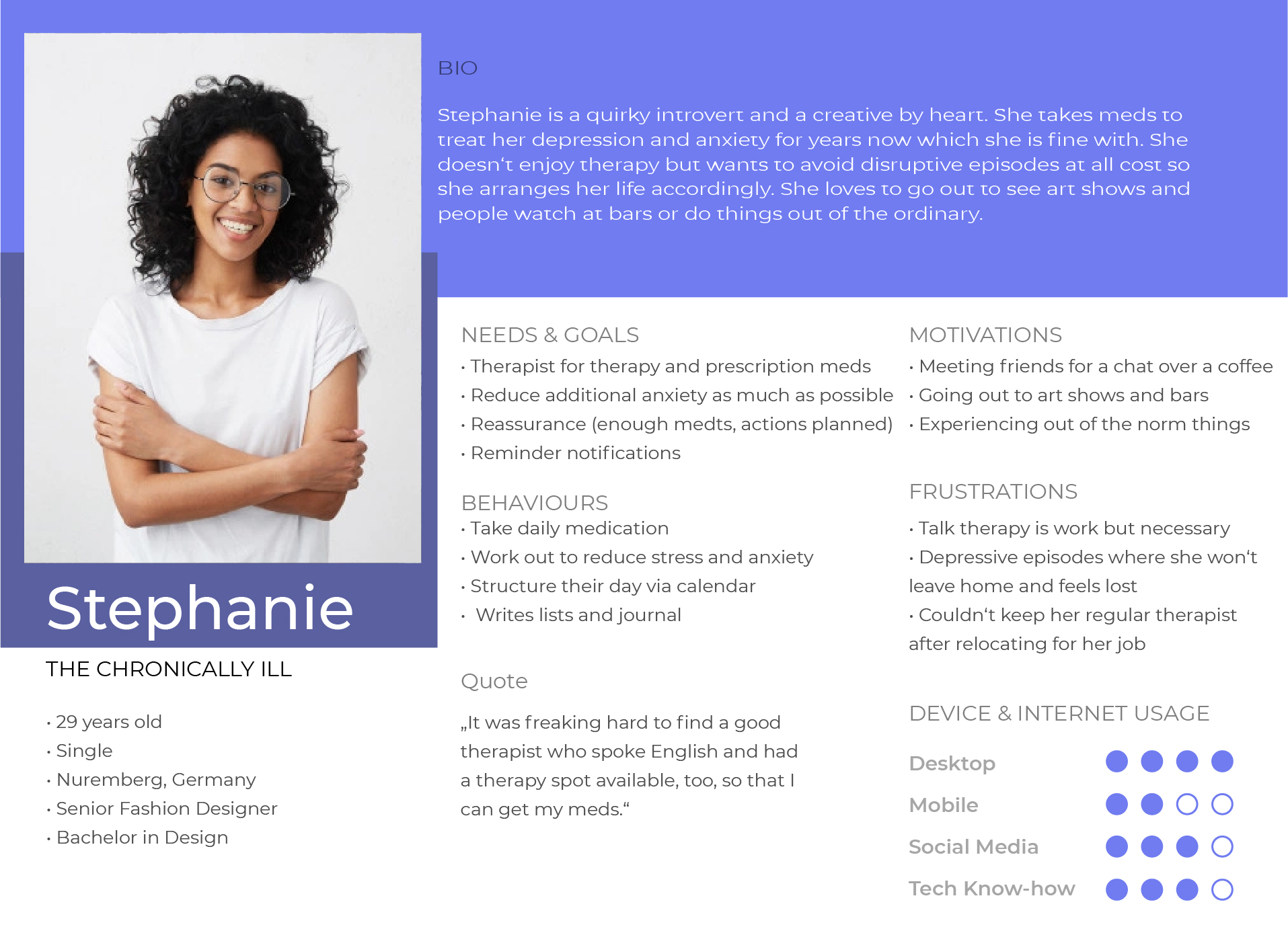
In order to put myself into the shoes of the persona I’ve mapped out user journey to better understand the emotions they go through.
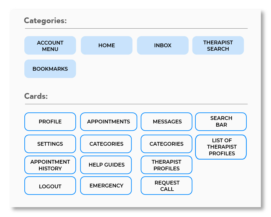
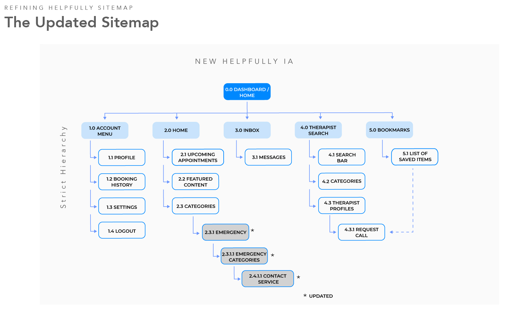
Information Architecture I.A.
Based on the user flows I’ve created a draft of the sitemap and translated it into a closed card sorting which I’ve conducted with five participants.
Closed Card Sorting
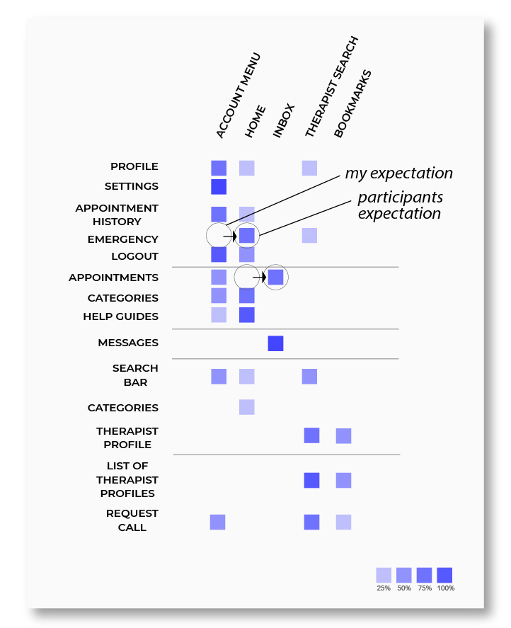
Learnings & Data Evaluation:
The card sorts turned out more informative than I expected it to be, although I only chose five participants they were different enough from each other and I think the outcome is ok.
Overall I think certain clusters stand out even with this low number of participants. Highlighted (circle) are the three cards that stood out for me.
I will move the emergency callout to the home screen as people obviously expect it to be there.
The appointments on the other hand are part of the translation mistake as I labeled them „confirmed bookings“ but my takeaway is that users expect to receive a notification in their inbox once a booking is confirmed.
The improved I.A. now reflects the learnings of the closed card sort.
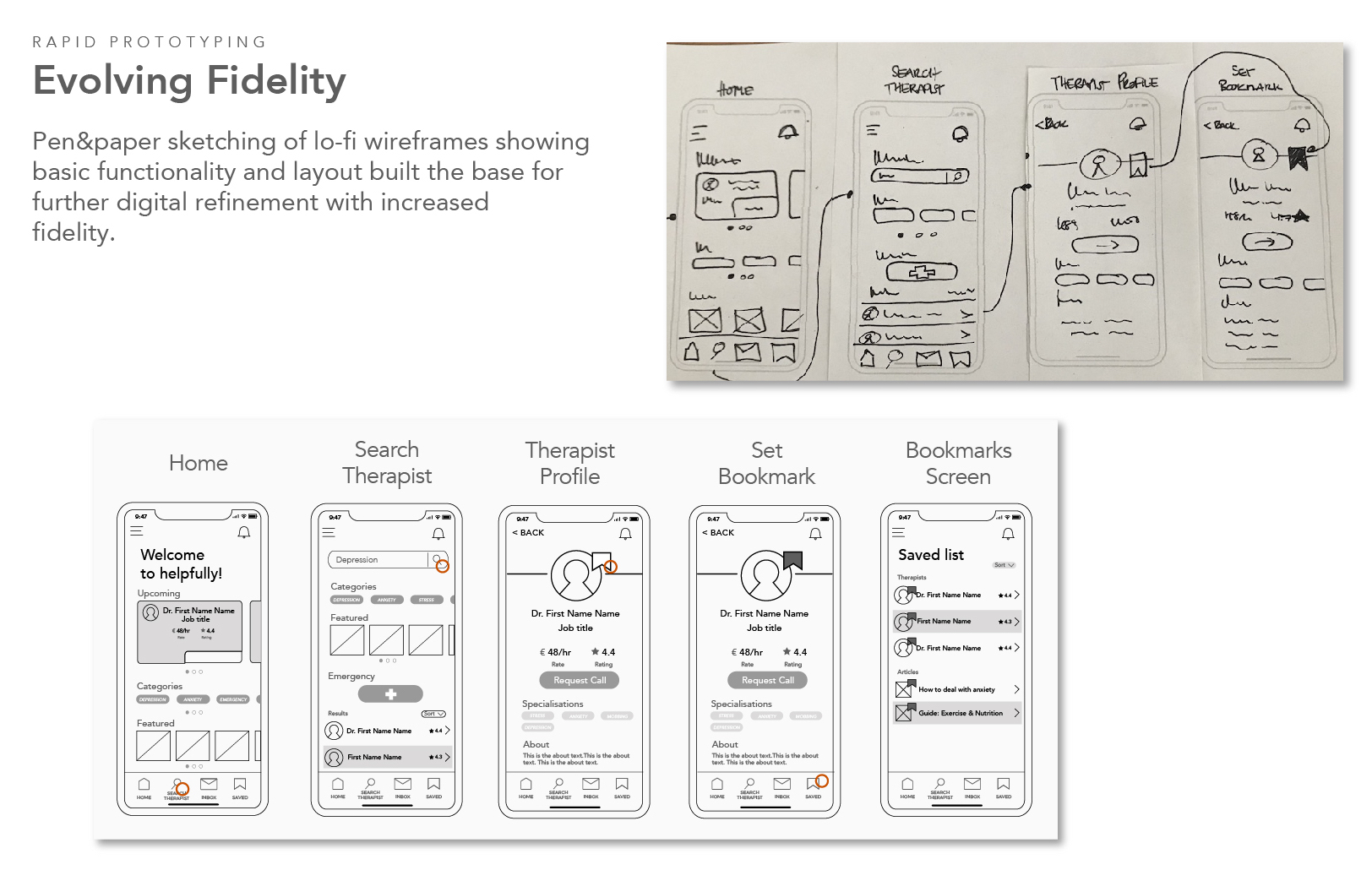
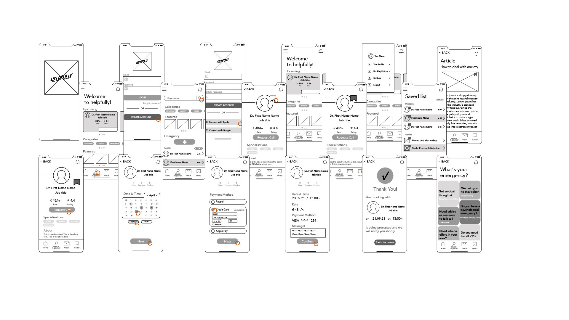
Design – Prototyping
Evolving fidelity from hand-drawn lofi to mid and preparing a click proto for usability testing.
Usability Testing
Goal: Was to assess the learnability for new users interacting with helpfully for the first time. I hope to observe and measure whether or not users understand the application, its value, how to complete basic user flows such as logging in/signing up, searching and saving therapists, requesting a therapy call, accessing featured content and using the emergency feature.
Methodology: The study will be moderated in-person as well as moderated remotely, based on the participant’s choice. Participants were given a set of scenarios and tasks to perform while I recorded their screen movements and audio.
Participants: A total of 6 total participants, who were recruited through my personal network, participated in the study. They were screened to fit the age demographic of young to senior adults to ensure they fit the persona of helpfully.
Metrics: Adoption of Jakob Nielsen’s scale for measuring usability errors.
Test Report
Six tests were conducted. Four could complete all tasks, two failed to complete the 5th. Four participants (P) agreed that the prototype was easy to use. The main challenges and errors are listed below:
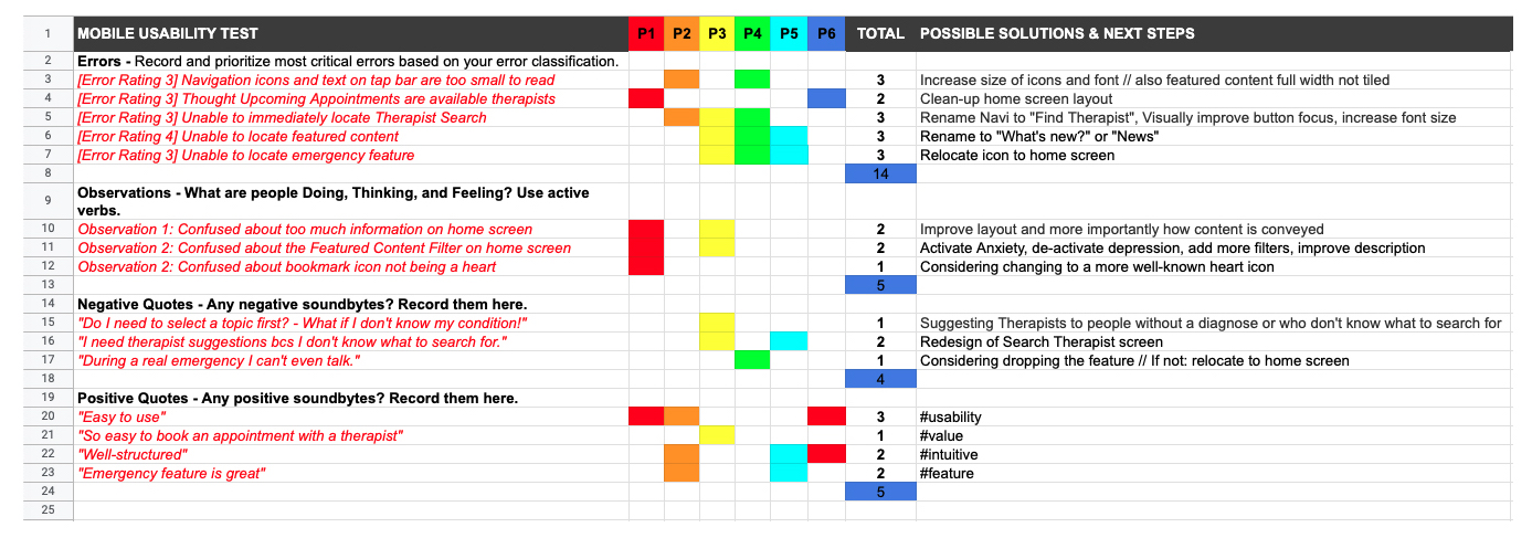
Conclusion
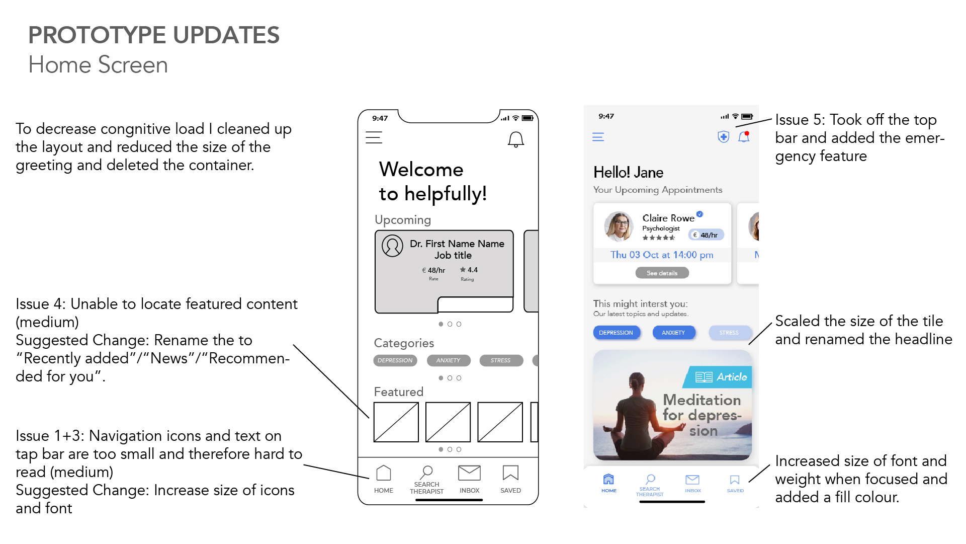
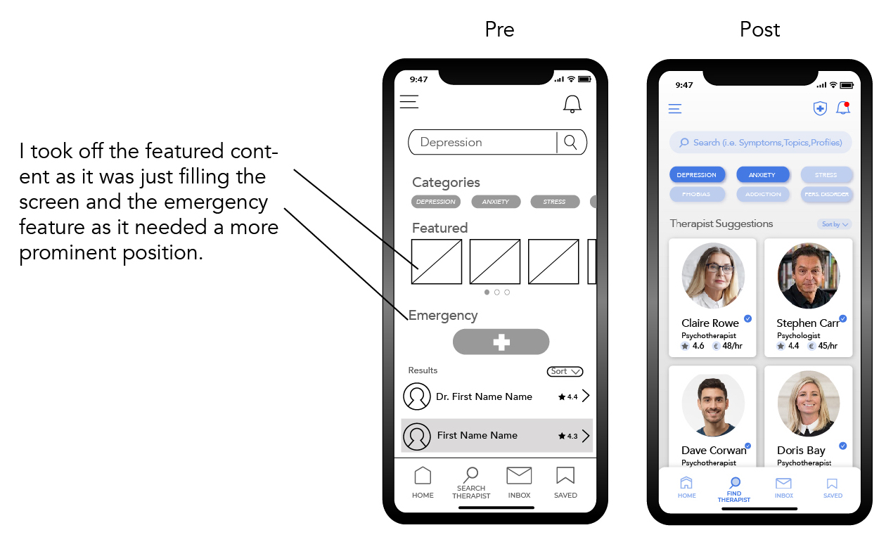
Overall the layout needs to be re-designed and simplified to reduce cognitive load as some participants were overwhelmed at first sight. The featured content section will change into personalized content – based on selected interest. The feedback on the emergency feature was positive but needs to be more accessibly placed on the home screen. One might argue if this feature makes actual sense but I will keep it in for now.
Updated Wireframes:
What they know vs. What we think they know
THE KNOWLEDGE GAP
Bridging The Knowledge Gap
This is probably the most crucial discovery during the whole design process.
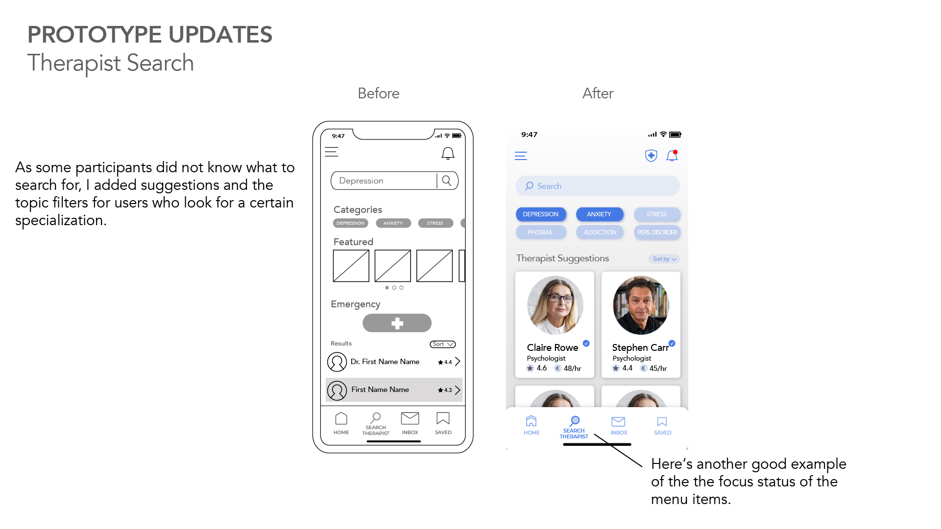
The test revealed that there is a wide knowledge gap between users who are informed about mental health topics and those who are not. Some of the participants just wouldn‘t know what to search for. The solution could be to offer available therapists as suggestions for users who do not know what to search for and also offer filter options for therapists emphasis areas in case users know what they are looking for. In addition the search offers entry of symptoms that would lead to therapists suggestions.
Preference Testing
For the test I decided to use the first screen of the onboarding feature and compare the positioning and design of the „next screen“ and „skip“ actions. A total number of 34 participants took part and now let‘s have a look at the findings.
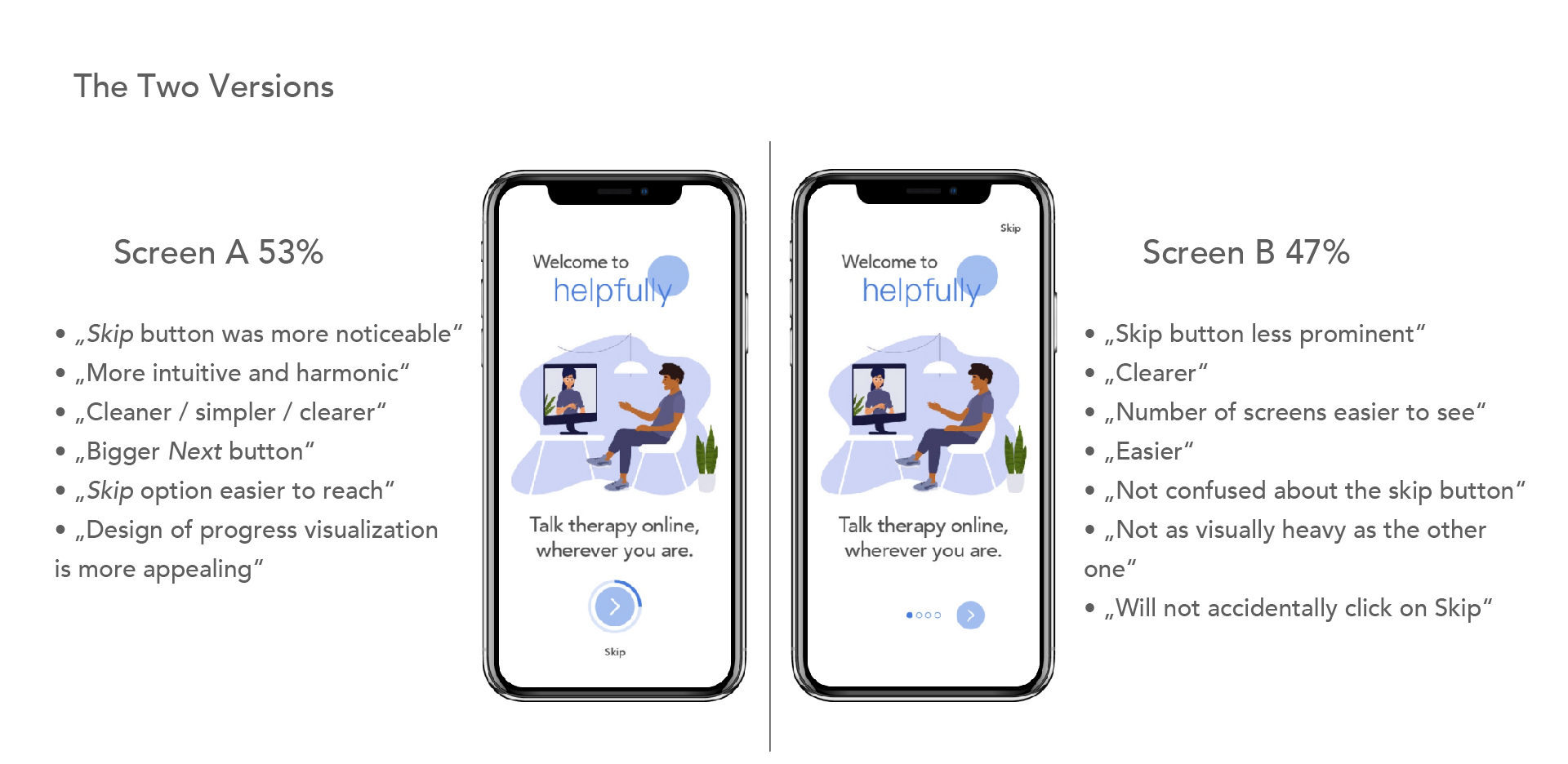
Result
The result clearly doesn‘t reflect a significant tendency towards one design. My take-away is that they both work and it‘s a matter of personal preference.
Going forward I combined the best of both versions based on the feedback provided. This includes the small progress circles that are easier to understand, the big Next button, and to conveniently reach Skip which is not only visually separated but I also increased the distance between the two, to prevent accidentally tapping on Skip.
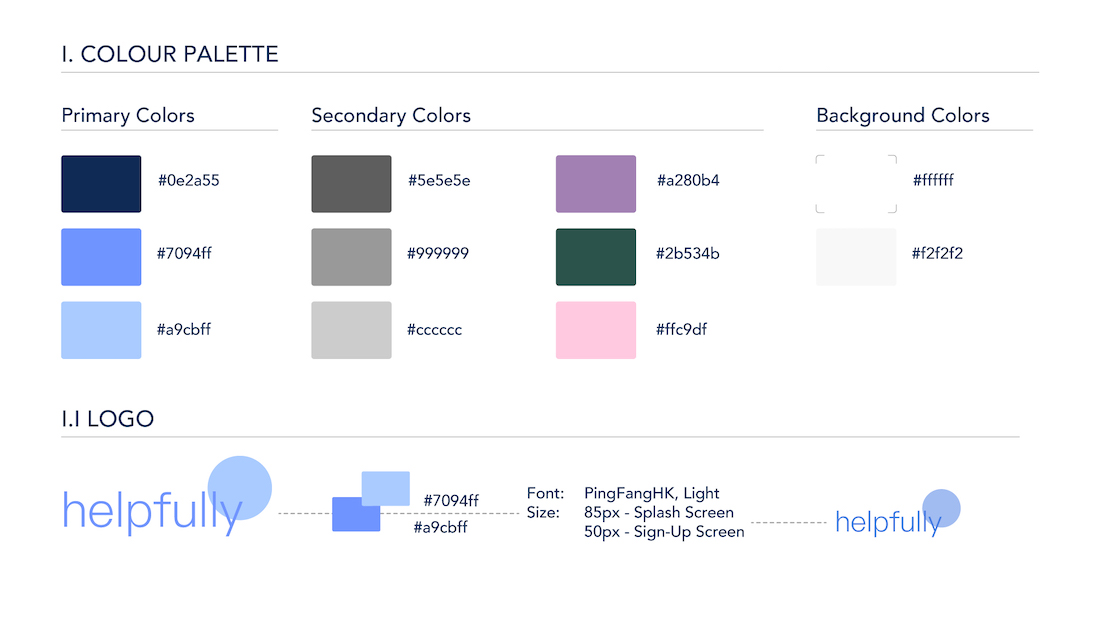
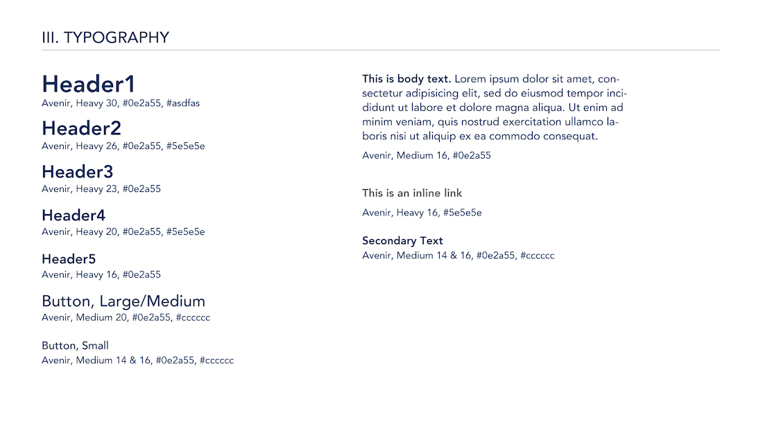
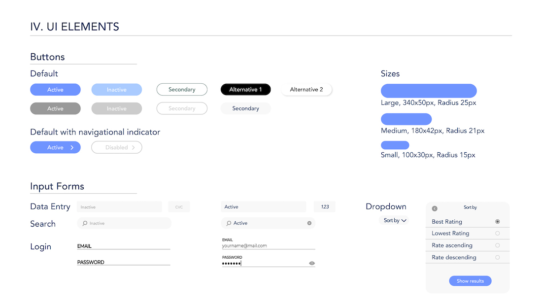
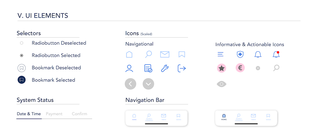
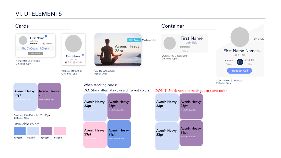
Style Guide
Emotional Design
According to color psychology the best suited colors would therefore be:
Blue: Stands for calmness, serenity and is associated with peace.
Lavender: Calms the nerves and allows relaxation.
Pink: Calming and warm.
Green: Connected to health and tranquility.


Final Design


